SESN Website Redesign
Desktop / Mobile Website
8 weeks // June - Aug 2022
SESN is a startup known for its zero-waste and easy-to-carry shower products. I worked on the official website that serves as a portal for visitors to understand the brand value and purchase products. My responsibility was redesigning the user experience for new and returning customers and ensuring they could find the information they desire effortlessly.
My role:
UX Research, Design, Prototyping
Tools:
Figma, Photoshop, Maze, Asana, Slack

Project Overview
SESN works with a number of e-commerce platforms to sell its products, but the information is cluttered on every platform. This project is aiming to ensure users locate the information they desire and to purchase product successfully.
Problem
In the project initiation, the stakeholder wanted me to conduct a usability audit and improve the next version before they move the website to another platform to make users feel more engaged in the experience. After my research and evaluation, I discovered that users felt confused about the differences between the Home page and Landing Page. In addition, users fail to find the About Us. This makes them feel the brand is untrustworthy, and discourages them to purchase products.
Goal
Make an ease-to-use navigation system to provide a satisfactory experience to new and returning users.
01
Research Discovery
Users lost interest within a second when they did not find the information as they expected
I was new to the team and had no experience using this website, so I did a quick research on my own to know how the current website does. Besides browsing the website like the users, I learned how users perceive the current website and if they can successfully complete the tasks they desire to on it from observation and interview.
Methodology

Interview

Affinity Map

Competitor Analysis
Interview


Finding 01
The Home Page and Handwash page confused user
Users swipe back and forth to understand the what are these two pages for, because they look similar.


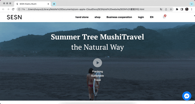
Home page (Left) and Current Hand Soap page (Right)
"It feels like there are two home pages when I browse this website! "
- participant 1, with confuse 🤔

Finding 02
Excess of information discouraged users to learn more about the brand
Users scrolled down the page without paying attention to the content, and expected to see the product info at their first sight
"The information is not well-organized. I feel exhausted and not sure what I am reading..."
- participant 2, with tiredness 🤯
Finding 03
Fail to find the "About page" and it made them hard to trust the brand
0 out of 5 users successfully locate the About page, because they only check the menu. And this makes them feel the brand is not trustworthy
"This website appears untrustworthy to me without About Page, and I don't want to purchase from it"
- participant 3, with disappointment 😥
Competitor Analysis
Considering SESN's business strategy, the competitors I closely monitored are companies that provide customized services, including Aesop, Cha Tzu Tang, Yuancare, and Jing Shen Yu. The high-level takeaway from this analysis is to create a user-centered design that allows an effortless experience for the users to achieve the goal(s) that they came to the site with.
The insights that helped to shape SESN include the importance of:
-
intuitive nav structure
-
obvious calls-to-action
-
a clear path to locate desired products.
02
Redefine Problem
Users are confused by the navigation system and there is no clear storytelling on the home page
Based on the learnings from the research and the face-to-face interviews with potential users, I believe it is crucial to redesign the current web structure, so I started by analyzing the Information Architecture.
Current Information Architecture

What I found:
1. One section is repeated on different pages
2. Descriptions about either brands or products on the same page, which makes the storyline not clear
I proposed to eliminate the redundant parts and Hand wash page to improve the hierarchy of information
Challenge
The Hand Soap page was designed to promote a featured product, and the team wanted to remain its function
Redesigned information architecture

Solutions
To achieve business marketing goals while ensuring that the users will not lost in the navigation system, I proposed to use the Homepage as a landing page, and show featured products in the banner.
Design Focus
Clear Path and Good impression
To make users easy to browse and find the information they need more efficiently, I defined the four design focus below:
-
Add Call-To-Action on the Home page and prioritized sections
-
Re-ordering the sections with a clear title
-
Create a clear storyline by separating content related to the brand or products
-
Allow users to know what products or services are provided easily and as soon as possible
03
Design & Iteration
I iterated the wireframe based on the internal feedbacks before going to interactive prototype

1. Add featured products section
it provides a quick view for novice users to have an idea of what this company makes and is served as a shortcut for expert users. However, the swiping function is removed based on user feedback.
2. Redesigned the layout
to improve consistency
3. Move the text and button
to ensure readability and responsiveness among different platforms
Wireframe of Landing Page

user flow of browsing product: Home page > Product Category > Hand Soap page
The products categories page was added in the second step to give new users a clearer view of all the products and scalability
Primary Design for Home page

1
Easy access for About us
Provide clear label for information of different categories
2
Call to Action button
Easy access for users want to purchase and a clear guide for what users can do
3
Featured Products section
Easy access for both new users and returning users
Before
The Home page was lengthy without clear visual hierarchy, and overwhelmed users without reasonable storytelling
After
The Redesign Home page has a clear visual hierarchy, pathway and divide information in a way user can easy digest

04
Prototype & Testing
Users find the information more accessible
I recruited 10 participants for user testing to evaluate if the design helps users to complete the primary tasks. The tasks includes:
-
Locating product
-
Find the About Us page
-
Purchase Product


80% users successfully complete their tasks and say this website is helpful to understand the brand
05
Final Design
When I delivered my first wireframe, I was reminded of the importance of having a mobile-responsive design. Therefore, as I was first creating mockups for desktop, I was mindful of how all of the design elements would look on a smaller screen. I prototyped and tested my desktop design first, while I worked on mobile mockups on the side.

A Glimpse of other pages I designed


What I would do differently
This project was completed virtually, and everyone wore many hats due to the team's organization. I collaborated with the marketing team and product team via Google Meet, Asana, and Slack. Although I shared the wireframe before I dived into further detailed design, the team changed back and forth due to a lot of ambiguity among the projects. It would be more effective if we had proper documentation about the requirement, timeline, and process to keep everyone on the same page and aware of it. Moreover, I would initiate communication more frequently to get crucial information ASAP.

