Costco in-store exclusive app
Mobile App
UX design
2 weeks// May 2021
Costco is famous for its unique warehouse shopping experience. Although its target customers are households, the Hsinchu branch attracts a lot of college students as being located near the university. My team is curious about the shopping experience and desires to improve customer engagement.
My Role: UX researcher, UX designer
My responsibility includes conducting user interviews with Costco customers, analyzing findings, designing user flows, and creating interactive prototypes to support usability test

Project Overview
PROBLEM
Customers suffer from uncertainty while enjoying Costco's unique, warehouse shopping experience.
OUTCOME
We created the in-store exclusive app to provide the assistance that customers need without being disturbed by staff and increase customer engagement during the shopping journey.
Demo: how the in-store inclusive app increases customer satisfaction
IN-APP FEATURES: SHOPPING MODE
Customers will be notified to turn on the shopping mode as they arrive at Costco to enjoy the following services.

IN-APP FEATURE 01:
SEARCH PRODUCT & NAVIGATE TO IT
The simple and clear navigation instructions will lead customers to the product they want effortlessly
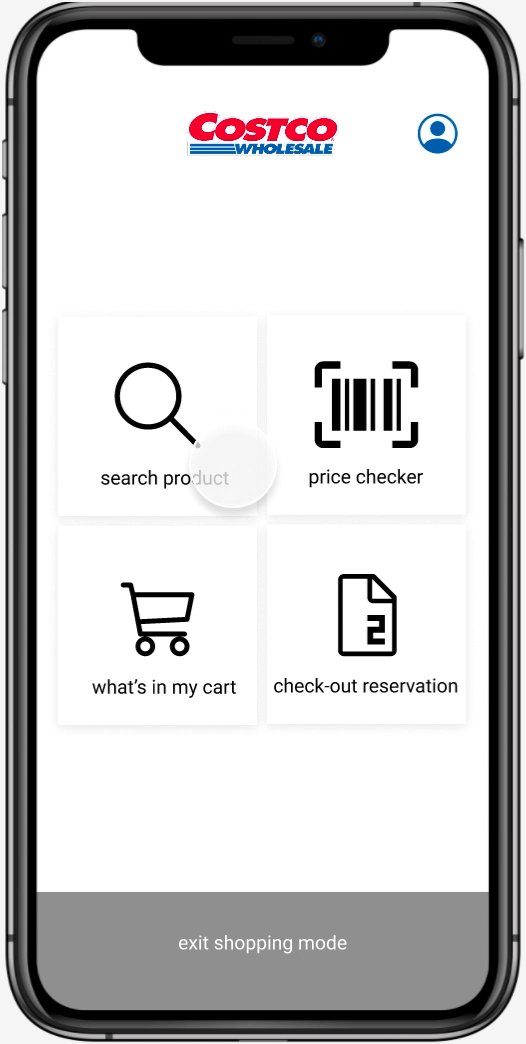
IN-APP FEATURE 02:
CHECK PRICE
Customers can check the price of every product if they forget by using an in-app camera, and the amount will be added into the cart.

IN-APP FEATURE 03:
JOIN THE CHECKOUT LINE
There is no more need to proceed or time wasted for checkout! The estimated waiting time for checkout will be displayed in the app, and customers can join the line right away.

Design Process

01
Research
To understand the warehouse shopping experience and empathize with users
In order to understand how general people feel about the shopping experience, we conducted a contextual inquiry to observe how users react and behave during their shopping journeys. We focused on participants' emotional fluctuations and thoughts with questions below:
Q1. What do the participants do during the shopping experience at Costco? What are their thoughts? What are the touchpoints?
Q2. Is it easy for participants to find a specific item in Costco?
Q3. Where do emotional highs and lows happen? Why?
Findings
01
Customers do not want their shopping route and journey to be interrupted
02
Customers are annoyed when they fail to find desired products or staff to inquiry about the information
03
Customers suffered from not knowing if they have to wait in a long line and the total product price
We created persona and user journey map to discover user's pain point and to better prioritize their needs.
02
Define
PERSONA
We created a reasonable abstract user persona based on the four participants observed by picking out personal backgrounds, traits, and behavior that were shared in common.

USER JOURNEY MAP
We illustrated four individual journey maps based on the interview results about customers' emotions and thoughts. The final user journey map was generated based on not only the individual maps but mainly on the user persona we have created.

Painpoint
Customers feel time-wasting finding products or waiting in line to check out and people who desire to pay in cash feel anxious when they do not know how much the products in cart cost in total
How might we make customers feel delightful and secure in their shopping journeys?
03
Design
To design an app that satisfies users' needs, I started with user scenarios and user environments.
Considering customers might be busy carrying their carts or holding a lot of products in their hands, I listed several requirements to avoid increasing users' cognitive load and make this app easy to use in their conditions:
For UX:
-
simplified the user flow
-
only provides essential features
For UI:
-
Make the buttons and icons big
-
Use the context easy to understand
-
strong color contrast to ensure accessibility

04
Prototype & Validate
SUS RESULT
We invited three participants to complete six tasks and conduct a usability test with System Usability Scale (SUS) according to their experience with the app. The SUS score is between A and C, with an average score of 75. It means people love this system to some degree but there is much improvement to be made.
What will I do differently next time
TESTING AND ITERATION MAKE PERFECT.
Considering the app often displays full of products on the screen, I tried to maintain minimalist while designing. However, the SUS test score is lower than expected as some of the users cannot find out the button to turn on Shopping Mode. If we conduct the test earlier, we will have a better idea of how user perceive this design and their expectation to make the design more user-friendly.

