Co-op project with Nextflix Studio
Enhancing audience engagement for streaming services
10 weeks // Feb - May 2024
The project focuses on the watching experience for the Action-genre audience on the Max (former HBO Max) streaming platform. Starting with user research and ideation, I collaborated with Nextflix professionals to identify and address 2 user pain points. This project includes a comprehensive end-to-end design process with 2 iterations.
My role:
UX Research, UX Design, Prototyping
Tools:
Figma, Zoom

Project Overview
To increase the audience engagement, I:
-
Facilitate multiple rounds of user testing with 150+ participants involved
-
Defined 10+ UX issues
-
Prioritized 3 actionable UX solutions
Challenge
The current platform fails to create audience engagement. engagement so they can keep users coming back to their streaming platform and gain more users.
Goal
Enhance the audience engagement by:
-
Creating an information booth during watching to smooth the user experience
-
Building an easy-to-navigate discussion board to strengthen audience engagement with action-genre movies
Audience Research and EngagementDigital Presence and StreamingWarner Bros. has expanded its reach into the digital world with the launch of its streaming service, HBO Max, which offers a wide variety of Warner Bros. films and TV shows, as well as original programming.HBO Max is described as Warner Bros. Discovery's "undisputed crown jewel asset," being 2021’s fastest-growing streaming service in the US originals demand share, with one of the industry’s most valuable and highly in-demand content libraries.
Enhance the audience engagement by:
-
Creating an information booth during watching to smooth the user experience
-
Building an easy-to-navigate discussion board to strengthen audience engagement with action-genre movies
Project Journey
To grasp our product's position and what consumers expect, I first dig into market research and competitor analysis. After that, I dove into user testing and analyzed user feedback to pinpoint the issues that stumble users to enroll in paperless statements. Throughout the project, I collaborated closely with Senior UX Writers and Senior UX Designers to ensure coherence between the copy and designs. In addition, I kept smooth communication with the stakeholders to ensure the feasibility of the designs.

Methodology

Market Research

User Interview

User Tests
Research Discovery
Audiences count on multiple platforms when seeking extra information and interacting with other fandoms
The current streaming platform misses the opportunity to provide knowledge and community for the fandoms. Besides watching movies, audiences are eager to gain information to engage themselves with the movie plots and they desire to discuss with someone who watched the same movie.
User Journey Map
Problem Statement
How might we allow the fandom to gain knowledge and interact with each other while actively engaging with the platform?
User Interview
We screened participants who were action-oriented, and conducted user interview with them focusing on their watching behaviros.
Persona
From User Painpoints to opportunity
Brainstorm

User problem 01
Users expected the system to automatically save changes when they switch the toggles
None of the users clicked on the button after they changed the paperless settings in the usability test. All of the participants thought their changes were automatically saved after they tapped on the toggle.
This redundant step made the user's task flow of managing their paperless settings unnecessarily complex.
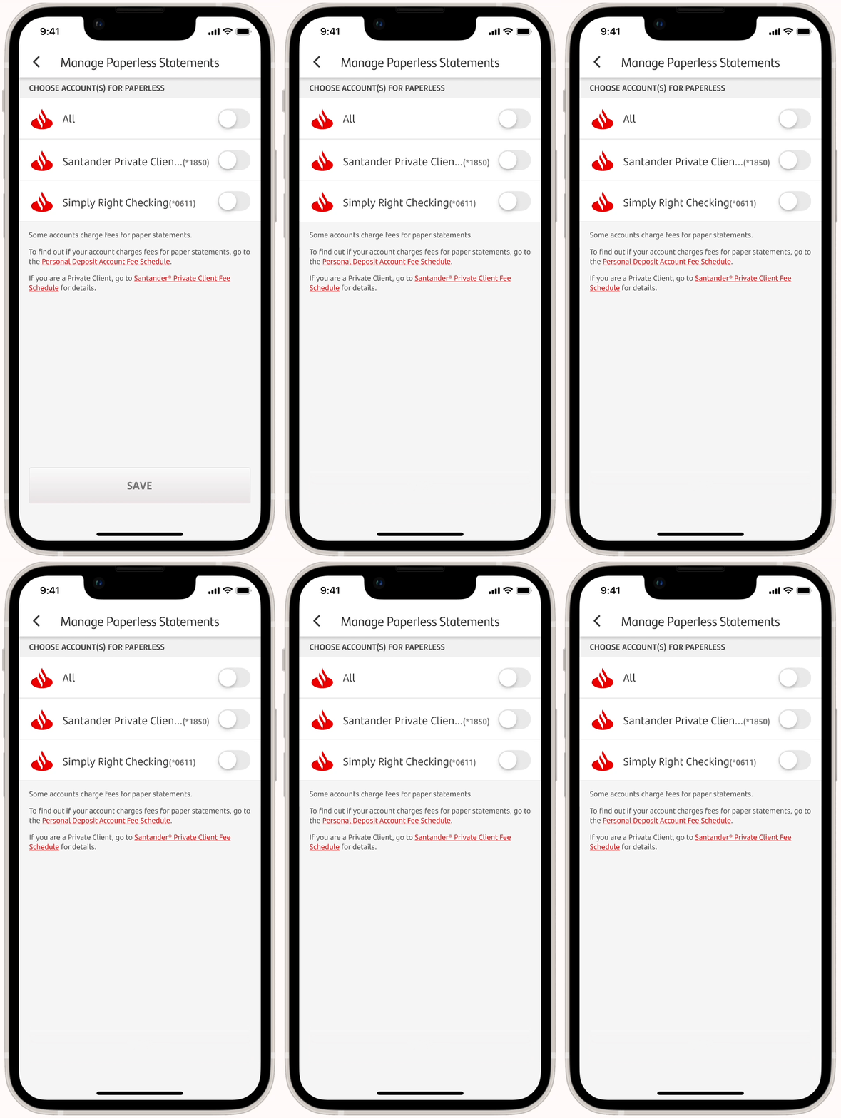
On the manage paperless statement screen, users are required to toggle the switch and then tap on the SAVE button when changing settings.
Solution
Remove the "SAVE" button to streamline the user flow

Consideration
Although this solution did not seem visually complex in design, it requires logical thinking when making decisions. For example, should the system save changes immediately after users make them? I consulted the team members with development experience to ensure the solution was feasible and would not cause issues with the current system.
Task 2. Improve User Satisfaction
Besides examining the user flow, I also evaluated the Santander app from the user's perspective.
Quick look into voice of customers
I analyzed 55+ user feedback responses from the past 3 months regarding paperless transactions on Medalia. One of the most common complaints raised by users relates to the paper fee.

User problem 02
Some users felt the paper statement fees are not proactively transparent
Customers were experiencing uncertainty about the paper statement fee because they felt the regulations were not clearly explained in the Santander Mobile Banking app. Some users complained that they only found out there was a paper statement fee after seeing it on their bills.
...I was not informed that I have to do a transaction so that they don't charge me a fee for paper statements"
- user 02
Insight
The paper statement fee was poorly disclosed
Current mobile experience:
-
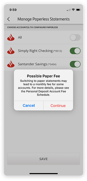
The paper statement fee was only mentioned when users change the setting from paperless statement to paper statement in a pop-up alert.

Proposed solution
Reveal the paper fees proactively
-
Disclose the possible paper fees on the Manage Paperless Statements screen, so users have a chance to learn about the information before making a change to their statement setting.
BEFORE
No information about paper statement fees

AFTER
-
Include a topic sentence to succinctly convey the fee information
-
Ensure consistency by following the design system - fonts and color

Challenge
Not all users will be charged paper statement fees
Apart from the customers who are enrolled in a paperless statement, the customers with Private Client accounts are waived for paper statement fees as well. Before sending the final design to the development team, I clearly defined the users and the condition of the paper statement fee to ensure that the design would be functional for all users.

General Client
(No fee waiver)
.png)
Santander Private Clients
(waive for paper fees)

Mixed Segment
(Customers who have both general and a fee waiver account)
Refined Solution
To avoid user confusion, I proposed to use conditional descriptions for different user segments. Also, I provided three different designs with documents for the development team to minimize the communication costs.

General Client
(No fee waiver)

.png)
Santander Private Clients
(waive for paper fees)


Mixed Segment
(Customers who have both accounts)

A glipse of a user problem in copy writing
The paper statement fee alert was not helping users make the decision because of its poor readability
The alert pops up when users change their settings to receive paper statements, informing them about the potential paper statement fee associated with this decision.
Feel free to reach out to me for more details about the UX writing I redesigned.
BEFORE
-
I identified 5 UX issues in this alert.

AFTER
-
Readability score is improved by 20%.


Final Deliverable
Redesign the user experience for paperless enrollment
1
The paper fee information is noticeable when users enter the manage paperless setting screen.
-
Users are able to read more details information about the paper fee regulations through the in-app preview PDF.
2
Fewer steps to complete the setup.
3
The alert for potential paper fees is easy to read.
What I learned
Working in a corporation with a large team structure was a new experience for me, and there are two biggest takeaways from this intern experience:
-
Detailed research helps to win the stakeholders' buy-in
It is challenging to make a change in a big corporation. I learned that every team has its stakes and priorities. Only solid and proven rationales will help get the stakeholders' buy-in. In addition, the nature of financial products makes me extremely careful about the design logic and thinking systematically to avoid causing any issues to users.
-
Overcommunicate early and often
Although the existing products had been published and running for a while, there was much ambiguity among the products that I needed to reach out to for more information. As many of the people who used to be involved in this product were dedicated to new products, it was challenging to schedule a meeting with them. I thus plan on a regular check-in basis rather than a random call until I encounter an issue. Although it took some time for me to adjust, I was lucky to collaborate with a team that was supportive and delivered the projects successfully.
In the future, I believe that I will be more proactive in initiating a conversation and be more comfortable sharing my imperfect work whenever I get a chance.

