Enhance recruiter workflow efficiency
Pulse is an All-in-one management platform to support healthcare recruiting agencies for client relationship management (CRM) and operations. However, usability challenges due to feature misalignment created friction in recruiters' daily workflows. In this project, I addressed usability issues to empower users for recruitment success.
Team
3 Product Designers
6 Developers
What I did
UX Research, UX/UI Design, Prototype, Usability Test
Timeline
September - December 2024
(4 months)
.png)
Project Overview
Pulse needs to improve the requisition page to ensure the recruiters' efficiency in managing requisition. In order to do so, I:
-
Facilitated 10+ contextual inquiries and user interviews with recruiters
-
Identified 5+ critical UX issues
-
Delivered 3 high-impact UX solutions
Problem
Despite its potential, the CRM platform's design caused unnecessary friction in recruiters' workflows, delaying hiring processes and detracting from the platform's value as a recruitment tool. Key challenges included:
-
A cluttered, non-intuitive interface
-
Inefficient filter navigation
-
Complex tracking and managing requisitions flow
Goal
The project focused on improving recruiters’ task efficiency and user experience by:
-
Redesigning the navigation to increase accuracy and scalability
-
Simplifying the requisition table to prioritize actionable insights and streamline workflows
Results
13.2%
increased overall recruiters satisfaction
26%
Reduction in task completion time
Methodology
To deliver a better user experience, I conducted 3 contextual inquiries and user interviews to get a deeper understanding of user workflow and learn about how they navigate the current product. In addition, we leverage competitor analysis to ensure design consistency. And I conducted A/B Testing and usability with 15+ users to ensure usability improvements.

User Research

Problem Identification

Design solutions

User Tests
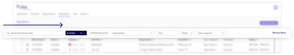
Current Requisition Page
Excessive task completion time caused by unclear visual elements and an unnecessary complex workflow
The requisition page is the backbone of recruiters' daily workflows. It helps recruiters manage job postings, track progress, and prioritize tasks. The current page design generates user friction to complete user daily tasks.
Challenge
-
Inefficient user flow
Currently, the page shows all company-wide requisitions. Recruiters are forced to search or filter to find the ones they oversee, which slows down their workflow.
-
Clutter UI
Recruiters have expressed frustration with system adoption due to the overwhelming and confusing visual elements.
.png)
Recruiters use this "User assigned" dropdown button to find their name and the requisitions they manage
Despite seeing these buttons/ indicators multiple times a day, users remain uncertain about their purpose
User needs
Recruiters prioritize tasks based on the likelihood of closing the deal, focusing on requisitions in later pipeline stages and closely monitoring application updates.

Recruiter
The first thing I check is if I have new applicants every day, and then I will start with the requisition that is "closer to money"
Once I update the requisition status, the table will reorder. So I emailed myself a hyperlink to keep on track of it."
Designs Principles
To keep the cohesive product experience throughout the collaboration, the UX team decided to establish the design principles upfront. With Pulse's value in mind - a versatile platform with robust functionality that serves as an essential tool for a recruiter's repetitive tasks, we define the core design value to cater its potential functions and growth:
Scalability
Implement a universal design system and layout logic to adapt for future growth
Intuitiveness
Reduce learning time by following user patterns to drive adoption
Efficiency
Prioritize usability and data visibility to ensure easy-to-use experience
UX problem 01: Inefficient Filter Panel
Horizontal navigation and confusing UI cause excessive scanning and filtering time
Left-to-right filter panel design slows down navigation time due to its conflicts with users' natural up-to-down reading patterns on web pages and mobile devices
Missing opportunity to provide faster access for user's tasks
Dropdown, filter, and cancel all-in-one button design confuses users
Challenges
The varying responsibilities of users result in diverse user workflow and differing filter usage
Testing & Solution
Restructured table with a side filter panel for easy access

Implement a tab function to streamline workflow
Before (2 steps)
Users must click 'User Assigned' and search for their names in the dropdown.
After (No action required)
Users can view the requisitions they manage upon landing on this page, while still maintaining access to all company-wide requisitions.
To ensure the filter layout accommodates various user group’s needs while remaining intuitive and efficient, we conducted A/B testing with 15+ recruiters from different proficiency levels.
Option A
Some users prefer a horizontal panel as it matches their existing habits
Option B
72% of participants prefer the side panel because it provides a clear input field and a narrow-focused area
.png)
.png)
UX problem 02: Complex Table Layout
Users struggle with irrelevant indicators and inefficient workflow
Despite displaying the pipeline stats, the requisition table fails to serve user needs in prioritizing tasks due to distracting designs.
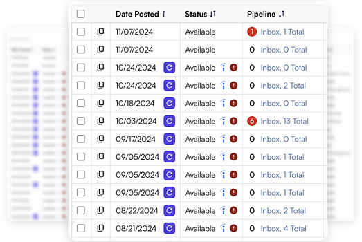
Less critical columns occupy key attention areas, diverting focus from essential information
Distracting icons and a cluttered layout
Users cannot see recruitment progress until click to the pipeline
Solution
Minimize clutter and simplify the table to enhance access to key indicators
By enhancing the table's functions, I streamline the recruiter's workflow of tracking and managing requisitions:
-
Declutter the table by using a universally recognized "red dot" design to indicate new applicants
-
Added Job ID field to minimize user reliance on external tools
-
Added a Progress field to simplify user flow in prioritizing requisition

The Progress field displays applicants who have advanced to later stages in the pipeline:
-
Helping recruiters prioritize the next steps, such as screening and follow-up
-
Benefit the company by encouraging recruiters to push the candidate further close to placement
Final Deliverable
Redesign the Requisition navigation and table layout
The redesign significantly improved recruiter workflows, making the CRM platform more intuitive and efficient. Here’s a look at the transformation:
Before
-
It took users 2 clicks to find out the requisition progress
-
Users keep track of requisitions by sending themselves a hyperlink
.png)
After
-
Visible applicant progress allows users to prioritize tasks with no further clicks
-
Users can identify Requisition through job ID
.png)
What I learned
Being a founding designer in an early-stage startup meant navigating plenty of ambiguity—whether it was in stakeholder requirements or the metrics we were tracking. What I would do differently:
-
Expand User Testing to include different user persona
Every recruiter had their own unique habits and workflows, making it difficult to create a one-size-fits-all solution. To truly find the best outcome, it became clear that testing with a broader group of participants was necessary to ensure the design met a wider range of needs.
-
Leverage Success Metrics to advocate for users and ensure team alignment
For a productivity tool, establishing concrete success metrics from the start not only allows for a clearer measurement of the design’s impact but also indicates business success through efficiency improvements. Aligning these metrics early on can help the team prioritize features that directly contribute to these goals. This approach should be critical in getting stakeholder buy-in, as the metrics provided solid evidence to support user-centric decisions and highlighted the tangible business value of the improvements.

