Increasing paperless statement adoption rates
Mobile app
10 weeks // June - July 2023
Santander Bank is a worldwide bank that serves more than 2 million users in the United States. As environmental awareness increases and users' habits change, the company aims to promote paperless statement features in their digital experience, including the existing mobile banking app, online banking website, and its public sites.
My role:
UX Research, UX Design, Prototyping
Tools:
Figma, Medallia, Javelin, UsabilityHub

Project Overview
Santander Bank needs to increase its paperless statement adoption rate. In order to improve the user experience, I:
-
Facilitate multiple rounds of user testing with 150+ participants involved
-
Defined 10+ UX issues
-
Prioritized 3 actionable UX solutions
Problem
The low adoption of paperless options indicates:
-
a lack of awareness among users regarding the benefits of paperless statements
-
potentially resulting in decreased customer engagement
-
an expanding environmental footprint and associated costs
Goal
Improve the paperless adoption rates by:
-
Simplifying user flows to smooth and streamline the user experience
-
Leveraging the paper statement fees to attract users for opting in a paperless statement
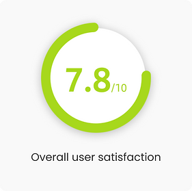
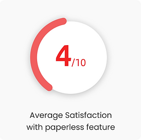
Results
20%
31%
Reduction in clicks when managing the paperless statement settings
Reduction in user complaints related to the paper fees awareness
The implementation is in progress, and I will update the data in the future.
Project Journey
To grasp our product's position and what consumers expect, I first dig into market research and competitor analysis. After that, I dove into user testing and analyzed user feedback to pinpoint the issues that stumble users to enroll in paperless statements. Throughout the project, I collaborated closely with Senior UX Writers and Senior UX Designers to ensure coherence between the copy and designs. In addition, I kept smooth communication with the stakeholders to ensure the feasibility of the designs.

Methodology

Market Research

Competitor Analysis

Voice of Customers

User Tests
Research Discovery
Santander requires customers to complete additional steps to enroll in paperless statements
As a newly joined member, I started with market research to familiarize myself with the market trends and consumer preferences. It guided me to focus on the mobile banking experience after learning that 85% of Americans consider themselves mobile-based internet users. Then, I move on to analyzing the enrollment process among Santander and its competitors.
Some competitors I observed
Finding
Santander asked for nearly twice more steps as its competitors

I analyzed and compared the user journeys to opt for paperless service within mobile apps among the competitors with our product with the following metrics:
-
Entry points
-
The steps to the paperless setting screen
-
The steps to finish a paperless setting
Task 1. Simplify the user flow
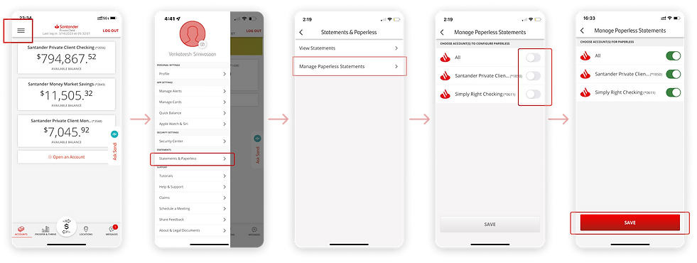
To ensure that Santander's app remains competitive, I closely examined its user flow to address the redundant step and improve the user experience.
Start from reviewing the user flow
I found that the combination of the toggle switch and the save button goes against best practices in design guidelines. This combination has the potential to confuse users and negatively impact their experience.
1
Entry
2
Statements & Paperless
3
Manage Paperless Statements
4
Users make a change
5
Save
From UX issue to User Problem
To consolidate my research insights, I conducted 5 usability tests on UsabilityHub. During these tests, I prompted users to think out loud, which allowed me to gain a deeper understanding of their behaviors.

User problem
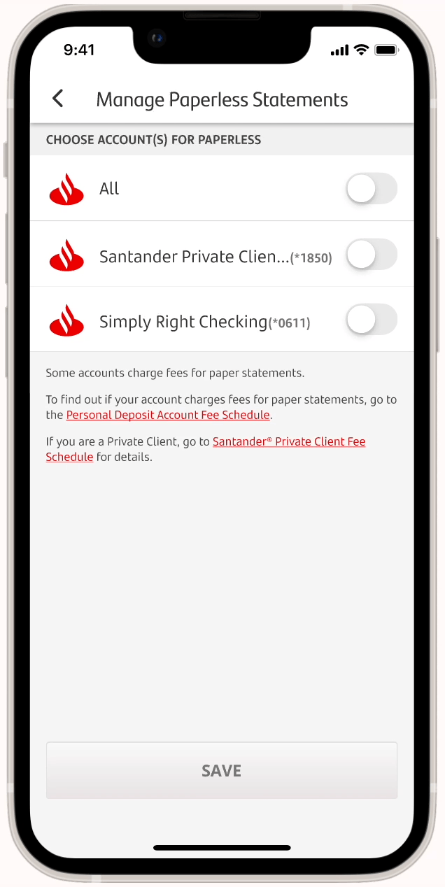
Users expected the system to automatically save changes when they switch the toggles
None of the users clicked on the button after they changed the paperless settings in the usability test. All of the participants thought their changes were automatically saved after they tapped on the toggle.
This redundant step made the user's task flow of managing their paperless settings unnecessarily complex.
On the manage paperless statement screen, users are required to toggle the switch and then tap on the SAVE button when changing settings.
Solution
Remove the "SAVE" button to streamline the user flow
Removing the "SAVE" button makes the enrollment process simpler and increases the usability by making it consistent with users' experience.
Although this solution did not seem visually complex in design, it requires logical thinking when making decisions. For example, how can we avoid users making changes by accident? I worked closely with the development team to ensure the solution was feasible and would not cause issues with the current system.
Task 2. Improve User Satisfaction
Besides examining the user flow, I also evaluated the Santander app from the user's perspective.
The satisfaction rating associated with the paperless feature is relatively low
By looking into the Voice of Customers, I synthesized 289 user feedback collected in the past 3 months on Medalia. Besides technical issues, the satisfaction rating was low because of the paper fee.

User problem
Some users felt the paper statement fees were not transparent
Customers were experiencing uncertainty about the paper statement fee because the regulations were not clearly explained in the Santander Mobile Banking app. Some users complained that they only found out there was a paper statement fee after seeing it on their bills.
...I was not informed that I have to do a transaction so that they don't charge me a fee for paper statements"
- user 02
Insight
The paper statement fee was poorly disclosed
Current mobile experience:
-
The paper statement fee was only mentioned in a pop-up alert when users changed the setting from paperless statement to paper statement.

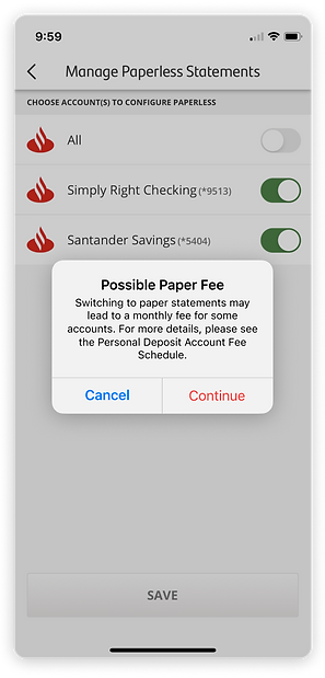
Proposed solution
Reveal the paper fees proactively
-
Disclose the possible paper fees on the Manage Paperless Statements screen, so users have a chance to learn about the information before making a change to their statement setting.
BEFORE
No information about paper statement fees

AFTER
-
Include a topic sentence to succinctly convey the fee information
-
Ensure consistency by following the design system - fonts and color

Challenge
Not all users will be charged paper statement fees
Apart from the customers who are enrolled in a paperless statement, the customers with Private Client accounts are waived for paper statement fees as well. Before sending the final design to the development team, I clearly defined the users and the condition of the paper statement fee to ensure that the design would be functional for all users.

General Client
(No fee waiver)
.png)
Santander Private Clients
(waive for paper fees)

Mixed Segment
(Customers who have both general and a fee waiver account)
Refined Solution
To avoid user confusion, I proposed to use conditional descriptions for different user segments. Also, I provided three different designs with documents for the development team to minimize the communication costs.

General Client
(No fee waiver)

.png)
Santander Private Clients
(waive for paper fees)


Mixed Segment
(Customers who have both accounts)

A glipse of a user problem in copy writing
The paper statement fee alert was not helping users make the decision because of its poor readability
The alert pops up when users change their settings to receive paper statements, informing them about the potential paper statement fee associated with this decision.
Feel free to reach out to me for more details about the UX writing I redesigned.
BEFORE
-
I identified 5 UX issues in this alert.

AFTER
-
Readability score is improved by 20%.

Final Deliverable
Redesign the user experience for paperless enrollment
1
The paper fee information is noticeable when users enter the manage paperless setting screen.
-
Users are able to read more details information about the paper fee regulations through the in-app preview PDF.
2
Fewer steps to manage setting changes.
3
The alert for potential paper fees is easy to read.
What I learned
Working in a corporation with a large team structure was a new experience for me, and there are two biggest takeaways from this intern experience:
-
Research helps win the stakeholders' buy-in
It is challenging to make a change in a big corporation. I learned that every team has its stakes and priorities. Only solid and proven rationales will help get the stakeholders' buy-in. In addition, the nature of financial products makes me extremely careful about the design logic and thinking systematically to avoid causing any issues to users.
-
Overcommunicate early and often
Although the existing products had been published and running for a while, there was much ambiguity among the products that I needed to reach out to for more information. As many of the people who used to be involved in this product were dedicated to new products, it was challenging to schedule a meeting with them. I thus plan on a regular check-in basis rather than a random call until I encounter an issue. Although it took some time for me to adjust, I was lucky to collaborate with a team that was supportive and delivered the projects successfully.
In the future, I believe that I will be more proactive in initiating a conversation and be more comfortable sharing my imperfect work whenever I get a chance.

